-
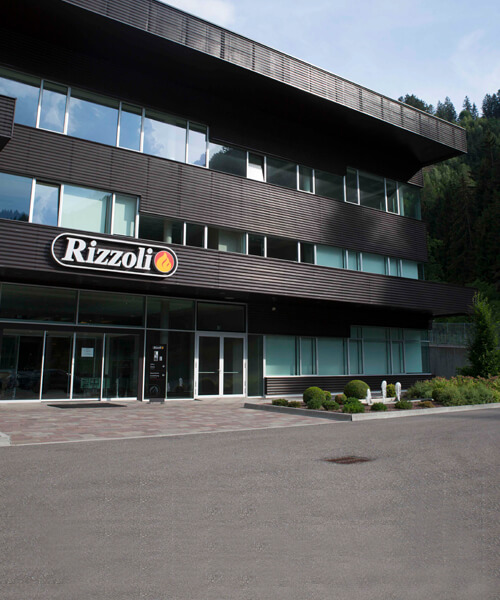
Firma
-
Firma
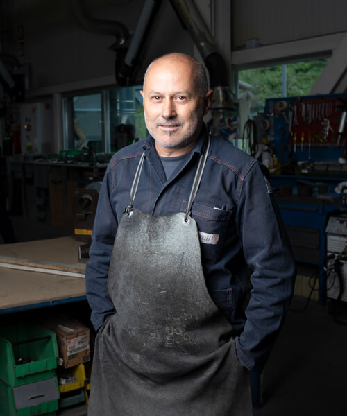
Náš příběh začíná vášnivým nadšením
-
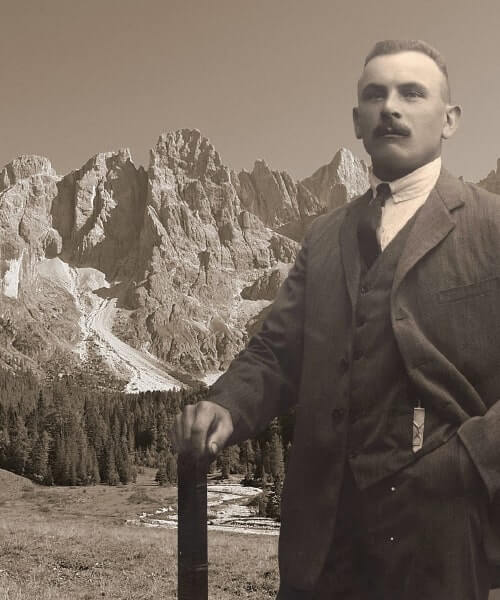 Naše historie
 -
 Filozofie toho nejlepšího
 -
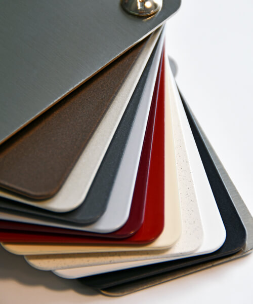
 Kvalita na míru
 -
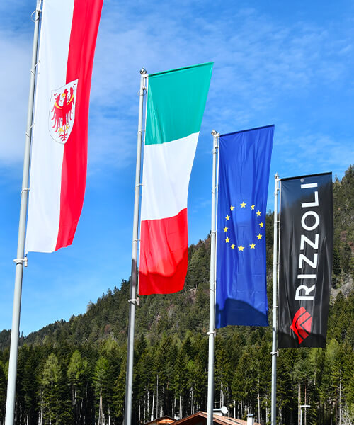
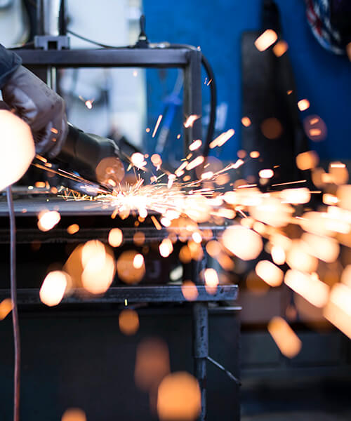 Italské řemeslo
-
Firma
-
Výrobky
-
Sporáky a teplovodní sporáky
-
sporáky a teplovodní sporáky
Náš sortiment výrobků pro vaši představu o kuchyni.
-
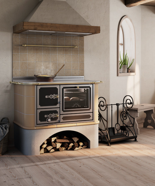
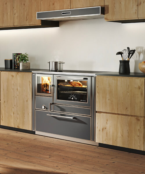 Sporák na dřevo
 -
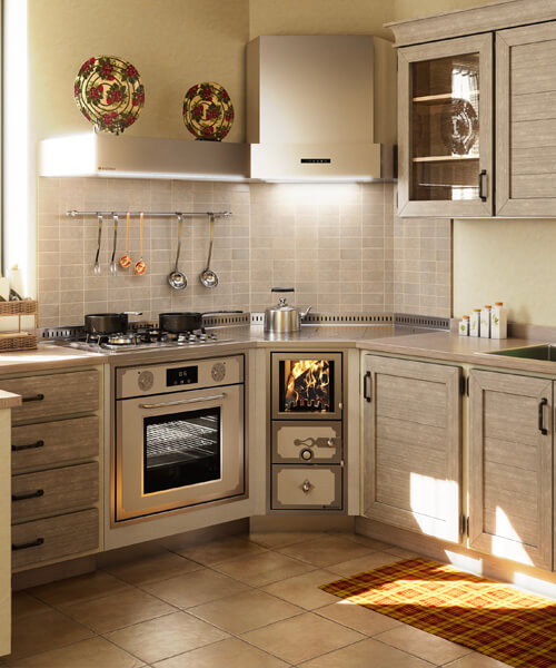
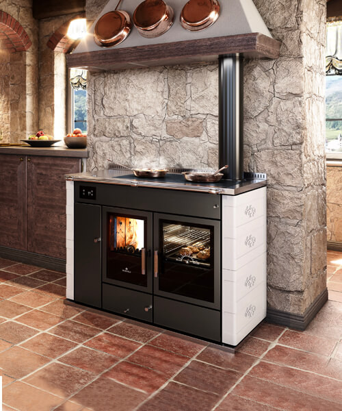 Teplovodní sporáky na dřevo
 -
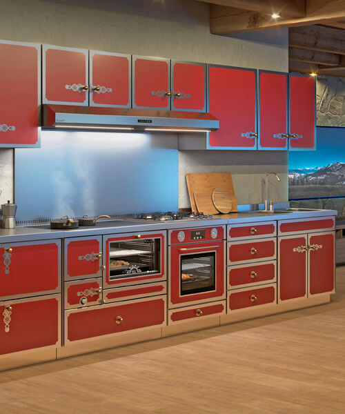
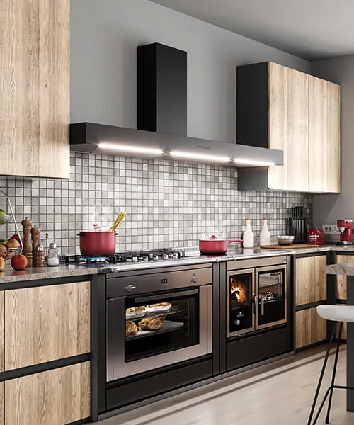 Plynové a elektrické sporáky
 -
 Výrobky pro kamnáře
 -
 Na míru
-
sporáky a teplovodní sporáky
-
Digestoře a ocelové nábytkové vybavení
-
digestoře a ocelové nábytkové vybavení
Design, přizpůsobení, inovace a žáruvzdornost.
-
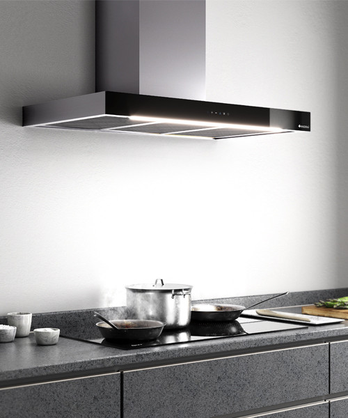 Odsavače par
 -
 Pracovní desky, skříně a dřezy
-
digestoře a ocelové nábytkové vybavení
-
Kamna a teplovodní kamna
-
kamna a teplovodní kamna
Nová řada výrobků pro váš obytný prostor.
-
 Kamna na dřevo
 -
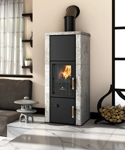 Teplovodní kamna na dřevo
-
kamna a teplovodní kamna
-
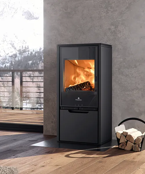
Krbové vložky
-
Krbové vložky
Exkluzivní design a výjimečný pohled na oheň.
-
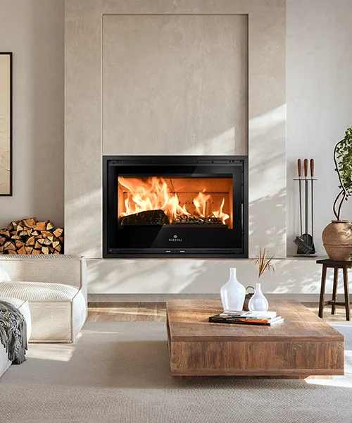 Krbové vložky
-
Krbové vložky
-
Profesionální sporáky
-
profesionální sporáky
Sporák na dřevo dovedený k maximálnímu výkonu.
-
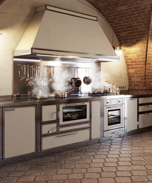 Profesionální sporák na dřevo
-
profesionální sporáky
-
Sporáky a teplovodní sporáky
-
Nástroje
-
Nástroje
Technické aspekty, rady a katalogy k prohlížení.
-
 Rady
Rady -
 Konfigurátor
-
Nástroje
-
Novinky
-
Novinky
Všechny novinky v jednom kliknutí!
-
 Rizzoli na veletrhu
 -
 Rizzoli na cestách
 -
 Nejnovější zprávy
-
Novinky
-
Kontakty
- Kontakty
-
 Kontakty
 -
 Pracujte s námi